The concept of modernism in art , at least the one that is the popularised to me and the one I most associated with - i.e modern art has always been a subject of confusion, in both its meaning and its interest to me. On one hand there is that minimalist quality to modernism that I thoroughly enjoy and appreciate , whether it is through architecture or my own work while on the other hand, It often comes up as pretentious , cold and just plain odd, all the while portrayed as "individual creativity and a new deeper way of looking at the world" as a substitute for actual skills and hard work ( at least , thats my view on it . ). Therefore, this lecture was a very good insight on what actually is modernity and the working mechanics of the one who practice it , which in the least , gave me some sort of sympathy and understanding.
To be modern is to be better than be own - that is what our culture identify modernity as. However , Ruskin in his research criticised this fact , stating that the work of new artist were not as good as the one in ancient times ( which again , turn back to my point of lacking skills and actual work.)
Paris in the 1900 was the image of modernity and was the main location of interest for this lecture, Its an example of how society has moved from the close-knitted village lifestyle where nature and agriculture plays the most part to big cities and factories and society became more condensed and standardised and efficient, along with that the advent of new technology gave humanity to alter nature itself => the world became more controllable ,all the while became more confusing , as there were just to many new things. Richard gave one example for this as the trottoir Roullant - the moving walk way, a funny way to move around the city which baffles many at the time.
There was also the idea of enlightenment - a turning away from religion to logic and reason.
with that => cities in the modern period became the centre of culture and life. and are celebrated vigorously , i.e monuments like the Eiffle tower showing the masculinity power of modernisation. Another exmample would be Haussmanisation - where old architecture of Paris is ripped out and rework with larger boulevards and the working class element of the city is move out and the centre became expensive and upperclass- which brought on a new sense exclusivity and division in social classes, which Richard extended with the work of artist at that period like Caillebotte and Manet, showing that even though society became more condensed , ironically we know each other less and became less human. Interestingly enough , Richard also gave examples of new social behaviours, through the flanders - the proro hipster of the time ,showing off how modern they are. At the same time, there is also a change in technique and thinking in art itself through Seurat's Grande Jatte and a laborous work that depict people that are modern yet faceless and automaton => symbolical of the standardised routines of modernity , where people seek to escape. The Kaiserpanorama symbolised a start to the move from viewing the actual world to looking at it through technology , being collective
yet were very individualistic.
The most interesting bit was seeing Max Nordau worrying vision of the world at the end of the 20th century , which almost accurately described or modern society, which also symbolised a part of modernity - the fear of being modern
Modernism is exactly that , it is the fear , the joy and the responses of artist to this changing world. It tries to capture the sensation of the new world through new techniques themselves, fully embracing changes in psychology. And with things like photography being able to capture the world more effectively and accurately , art itself has to altered itself to a new position of being a better way to do it => doing the things that is out of the box , more creative and interesting, which again I'd argue in some aspect .
I can appreciate however , technological development giving way to a better understanding of the world and human body , and most importantly - movement which forms the bases for animation production. Its also very interesting to see works on this again like Giacomo Balla and Duchamp, as during my A-levels , I have familirized myself with their work as I was doing a bit on movement in art. Perhaps it is also this rush of movement and development that influenced things like James Joyce and cubism, where it tries to use chaotic shapes and angle as a symbol to the constant disturbance and dynamics in the modern society , where you are constantly bombard with information.
And with that , a conclusion is that modern is not neutral , it suggest being better and improvement , and thanks to it , it gave rise to a wider vocab of style, education and the idea that forms follows function
Wednesday, February 22, 2017
Friday, February 10, 2017
12 Frame or less : new idea composition
Played around with compositions I made from images gathered on the Internet and my sketchbook. The final results turned out more in line of the task requirements , as well as being a bit more abstract. I Like the use of a general silhouette as a main character. This means that it is more easily relatable to the audience since it doesn't refer to any particular character, hence it could be anyone. If there is something to be said , its that the composition seems a bit disconnected when first skim through , can get a bit crowded a parts in terms of things on frame, but this is a very minor problem , as I was aiming to create an image sequence that describe a narrative rather than a proper storyboard .


Thursday, February 9, 2017
12 Frame or less : new ideas
Checking back with the brief's goals , I found out that the story board idea was not actually fitting with what the task asked , therefore I came up with a new narrative , using the images I've compiled as a base for its style : a composition of cuts out and images from the web that tell a specific scenes of the narrative , as follow :
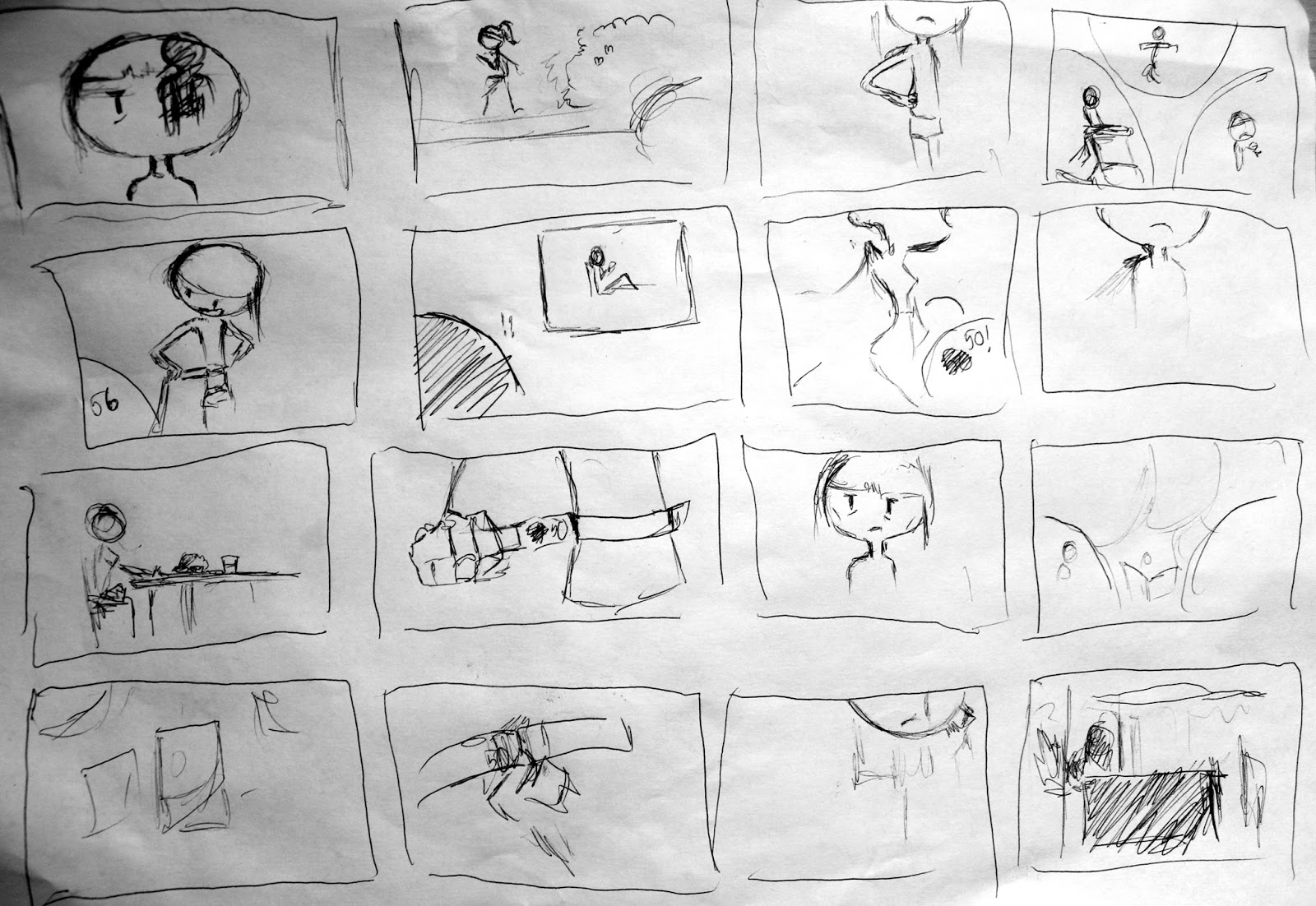
Girl and Envy
Frame 1 : Tv showing glamour publicity
page in a TV screen, a lone silhouetted figure on pillar
Frame 2 silhouettes of people reaching
toward the TV , single GREEN silhouette being noticeable – our character .
Green for envy
Frame 3 : Something with envy surrounding
the character indicating a desire
Frame 4 : publicity weight on her shoulders
- competition to be glamorous
Frame 5: Girl shopping scenes and
exercising with image of publicity behind- process of trying to be glamorous
Frame 6 : Girl exhausted , “present is
never enough for publicity “ page from sketchbook behind
Frame 7: girl climbing on piles of money
signifying the amount of spending for her venture
Frame 8 : Reaching the top with silhouette envying at the bottom
Frame
9 : Glamour is a lonely place-
girl all alone on a pillar , vast empty space surrounding her
Frame 10 : Too glamorous for your own good
, people leaving and forget you for different glamour- green silhouettes and
background , only the girl is white
Frame 11 : Problems of the venture caught
up to her – health , debt , stress
Frame 12 : drags her off the pedestal – end
of a brief glamour .
In 12 Frame or less : Refined ideas
Some more in-depth character design and storyboard done


 As for the storyboard, I have to figure out how to shorten it down to the 12 frames limitation, which is indicated by the x marks for discarded scenes.

For the final product , I probably will do it digitally , using a greyscale type of colouring to really add to that grim and sad effect on the environment and character.


Wednesday, February 8, 2017
12 frame or less : Sketch story
A very rough sketch on my storyboard idea :

Its going to be a story on an anorexic type of situation , where the main girl is not actually sick but are driven by publicity glamour. Although it is a very short time frame to deliver a full story , I feel that I have something decent here, reflecting a very real situation of current society
12 Frames or less : Initial ideas
My theme as stated before was on societies , in particular , John Berger's idea of glamour , envy and the influence of modern publicity on daily life. The current reality is that we are surrounded by a sea of advertisement for brands and products, many of which portrayed themselves as the thing to be , something desirable and achievable to us, and that we would do much better in our life with them . Whether this is a magnificently delicious looking-photoshoped photo of a big mac , or bikini models with the waist of a broom and legs that stretch for miles , corporations bombard us with this lavish images , turning the modern population into an army of mindless consuming ghouls that would obey the instruction of this capitalistic market of work , buy , consume , enrich without any shred of self-control and recognition.
Extending on this fact , this blog by an unknown author (2014 ,Glamour and Envy: remarks on the Madness of Consumerism, with John Berger…; Awestruckwanderer.Wordpress; accessed Feb 8, 2017 < https://awestruckwanderer.wordpress.com/2014/02/03/glamour-and-envy-remarks-on-the-madness-of-consumerism-with-john-berger/ > ). really highlights the key points of this situation , all the while providing me with some real world example that influenced my image making. In particular, it is the effects of publicity having on the image of a woman, which led to the gym pandemic , plastic surgery and anorexia in the West . The topic of a modern day anorexic that is pushed along by publicity's view of the "desirable look" for woman - i.e slim everything ( prevalent in the fashion industry ) interests me very much.


Extending on this fact , this blog by an unknown author (2014 ,Glamour and Envy: remarks on the Madness of Consumerism, with John Berger…; Awestruckwanderer.Wordpress; accessed Feb 8, 2017 < https://awestruckwanderer.wordpress.com/2014/02/03/glamour-and-envy-remarks-on-the-madness-of-consumerism-with-john-berger/ > ). really highlights the key points of this situation , all the while providing me with some real world example that influenced my image making. In particular, it is the effects of publicity having on the image of a woman, which led to the gym pandemic , plastic surgery and anorexia in the West . The topic of a modern day anorexic that is pushed along by publicity's view of the "desirable look" for woman - i.e slim everything ( prevalent in the fashion industry ) interests me very much.


OUAN401 : Lecture - Subjective colour - Colour and contrast ( Part 2 )
Starting out the lecture with a warning about having retinal damage at the end is more than enough to get me pumped for this. Alot of the first part of the lecture is just recapping the last session, which much of the today's lecture is going to extends. We first discussed different sets of contrast:
tone, hue, saturation, extension, temperature
Contrast of tone : monochromatic
controlled by our rods.
This is probably the most widely-know form of contrast in digital painting. What interesting is how colour have their own tone contrast
Contrast of Hue : Differentiate by the position of colours on the colour wheel , the further apart , the more the contrast . Seeing how some colours affect each other ,making them uncomfortable to see is very interesting
Contrast of saturation : Contrast of proportion
This a very very interesting topic indeed , as it would dictates how much of one colour should be use in certain situation to create a balance in the composition. It also would identify different meanings it can portray. It would also affect the attention of the audience when looking at said composition, as unbalanced contrast can draw the focus of the eye toward only a specific part, instead of viewing the entire thing. This is one of the ability that I have gained unknowingly from long periods of practice, so its very to actually identify what it is
Contrast of temperature : I would say a very psychological of contrast. Its also amazing how our eyes would perceived even the tiniest of differences between low-level contrast that help us to separate them, particularly how we see different non-existing gradients appear in flat-colour contrasts, thanks to a combination of tone, hue and temperature
Complimentary contrast:
Touching back on complimentary colours, we see how contrast between complimentary colours is pretty painful to look at , as both colour would vibrate as they try to get our attention.
Simultaneous contrast :
Formed when boundaries between colours vibrates. Its weird seeing how colours can change through optical illusions that our eyes create just by changing the level of contrast through many of the examples that Fred provided for us.
These different contrast really highlighted the fact that what we see might now what we think it is. And that our eyes works in quite interesting way of retaining after image that can affect our sight even after we have seen a set of colours. As professionals , it is crucial to understanding so appropriate methods can be taken to ensured the right quality for your product and more important, that it fits exactly to what the customers would like to SEE, without optical illusion getting in the way
Wednesday, February 1, 2017
OUAN401- Lecture : Systematic Colour ( Part 1 ) - Introduction to Color tehory
The lecture today touches on some of the more relevant topic to animation ,or in art in general , as a start to a whole new part of the lecture program which focuses on the theoretical and practical development of visual language, as well as going in deeper into the previous topics. Colour theory is probably a knowledge that is considered common sense within the art community, whether you actually know it or not. Its sometime is a skill that you just picked up along the way through many many practices, but actually learning about it is quite interesting and different from what you think.
To quote Fred : " Colour surrounded by other colour which affect the way we see that colour ". This is a response to the fact that in practice, we would often deal with independent colour , ( we choose a colour to put in ) .
The first part start out as a scientific insight on what is colour, as well as how our brain turn what we see into the colour that we perceive. Colour is linked to light ( FACT ) , hence our perception of colour is based on light. Each colour is a different wavelength, some we cannot perceive hence we see it as the same colour. Fred also demonstrate on the fact that the reflective ability of light and the importance of the surface it is bouncing off through the multi-colour paper experiment, in which , different colour paper will bounce light in a different way hence changing the colour we see from the actual colour of the paper.
Our eyes have 2 kind of receptors, rods pick up shades of black and white, cones allow the brain to perceive colour. Type 1 cone is sensitive to red-orange, type 2 green and type 3 blue. With that comes an interesting fact that , it is a combination of these types that we can perceive intermediate colours like purple through a combination of red and blue, hence , those types of colour may not exist at all and the only colours that we actually SEE is red, green and blue! This is really a blow-your-mind fact to me.
Fred also touch on the fact that everyone perceives colours differently and logically nothing can be identified exactly ( the Dress story comes to mind )
After this came a brief introduction on the colour wheels , primaries , and complementaries. Complementaries are chromological opposites , that when you mix those 2 colours together you get a grey colour. These is because the the wavelengths of these 2 colours cancel each other out, creating a colour that has a neutral tone with a pigment of grey. This how we see most of our world, a set of neutral colour with high-points.
This bring us to colour modes : RGB and CYMK , 2 of the most prevalent aspects in digital media. Interestingly enough , they are entirely separate modes but RGB serves as a secondaries to cyan , magenta and yellow. This is more clear in the difference of colour system , subtractive and additives. in which , RGB and CMYK switches roles as primaries and secondaries according to the system in use.
Some important terms:
-Chromatic value : Hue + Tone + Saturation
Hue : referring to the colour itself
Luminance : within each hue, how bright the colour it is or how vivid. - Shad ,Tint and Sint
Saturation : the amount of colour we can see and how pure the colour is . Effective saturation can be done through changing the shads ( making it darker ) or the hue ( changing the colour entirely )
To round it of , a little examples by Fred , using just red demonstrating how a surrounding colour can change our perception of colour ,like is a red is surrounded by a brighter red it becomes darker. Much like the same way how in my illustration , having a white background always make the figure darker than it seems which explain why most painting start out with putting some kind of colour on to cancel out the white
Subscribe to:
Posts (Atom)